Upgrading yourcompany website can be an unexpected expense that may not seem worth the investment. Believe me, it's worth it.
A positive user experience (UX) on your website can mean the difference between a few conversions a month, or a hundred.
Imagine looking for an emergency plumber on Google. Are you going to enjoy a scavenger hunt around a website to find the contact phone number while your bathroom is flooding? Probably not.
Most people would navigate back and choose another business that makes it easy to call them.
As I always say, the easier you can make it for potential customers to contact you, the more likely they will. So with that in mind, lets take a look at some UX pain points.
1. Load Speed
Today, the majority of internet use is done on mobile devices; and that's not a broad statement - it's a fact.
Mobile internet usage has officially surpassed desktop use and continues to climb. Which means that a fast page load speed is more important than ever.

There is a direct correlation between website abandonment and page load speed. In a page load study by Kissmetrics, 80% of people said they expected a page to load in 10 seconds or under.
If those statistics weren't eye-opening enough, site speed also affects your website's ability to rank well on search engines. Page load speed is a factor in Google's ranking algorithm and even Facebook just announced that they are going to start ranking faster loading pages higher in the news feed.
That means if your website is slow to load, it might never have the opportunity to appear on the front page.
If it does make it past ranking gatekeepers, and still doesn't meet the demand of mobile users with short attention spans, they'll just move on.
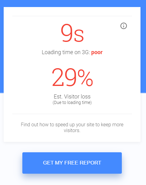
I encourage you to use this Google tool to test your website speed and make adjustments if necessary.
2. Mobile Compatibility
Along the same lines as page load speed, a website should be compatible with mobile devices. While your 1998-era website might technically work on a phone, it needs either be designed in a "mobile-friendly" manner or it be responsive.
What's the difference?
Mobile-Friendly means the website is designed so that it will perform well no matter what device the user is viewing it on. This usually means that it is simplified so that it will look good and be functional on mobile devices.
The website doesn't change - it remains the same across all platforms.
Responsive websites actually change to fit the device that they're being viewed on. For example, the menu might have tens of options on a desktop, but be narrowed down to a few categories on an iPhone.
Regardless of which method you choose for your website, mobile compatibility means a couple things:
- Fast load speed (which we already covered).
- Font large enough to read on a teeny-tiny device without pinching and squeezing.
- Condensed menus.
- A fixed width so that the user isn't forced to scroll horizontally.
If your website doesn't fulfill those four basic mobile compatibility requirements, you should assume you're losing potential business on a daily basis.
3. Company Information

This one may seem like common sense; but there have been instances when we've come across company websites that don't have basic contact information on them.
I can promise you that the majority of potential new customers who come across your website are not going to hunt for ways to call you. They're will simply click the back button and call someone else.
You need to make it as easy as possible for your customers to contact you. That means the following components need to be readily available on every page of your small business website.
- Phone Number
- Address
While we're on the subject, it's good practice to make sure that your business name and industry is prominent on your site. For example, if you're a plumber, instead of using images of a happy family, you should use imagery that depicts plumbing services.
4. Click-to-Dial, or Lackthereof
The click-to-dial feature is a healthy marriage of the previous two subjects.
While it's important to simply have your contact information displayed on your small business website, mobile users will expect your phone number to be more functional.
Click-to-dial allows people to simply tap on your phone number and begin calling you. How amazing is that? Talk about making it easy for your customers to contact you!
5. Functional Design
Good website design is something that is subjective to the viewer, obviously. So if I think your website is ugly, that doesn't necessarily mean that it is.
A good rule of thumb to make sure your website design is attractive is to keep up with the industry styles.
Lets take a look at a website that's living in the past:
Sure, this might have been amazing in it's time, with it's cool animated components. But this user experience just doesn't fit the bill anymore.
You can barely read the red text over the image. And I dare you to check out the website on mobile.
Compared to a modern design:
This example has a design that is popular right now. There is a minimalist quality to it. There's no unnecessary text. The majority of the website is composed of high-resolution images or videos. And it's responsive design adjusts on mobile to be highly user-friendly.
If your website looks closer to example A, you should consider a re-design.
Also, It's also important to note that some features just plain don't work on a lot of devices. No one should have to download a plugin just to view your website. I can guarantee you that if your website asks a potential customer to download something, they're going to run away screaming spam.
So steer clear of Flash and unnecessary website bloat.
6. Intrusiveness
Sometimes as business owners and marketers, we forget what it's like to be a consumer.
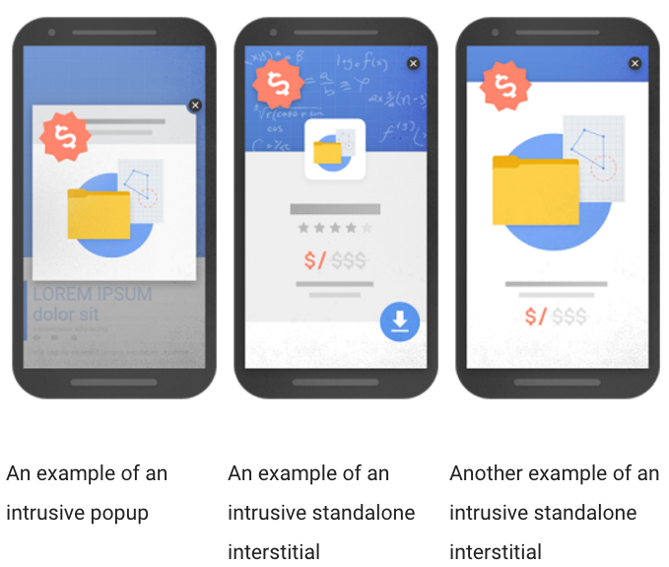
Pop-up ads, or interstitial's (pronounced "inter-stish-al's") as Google calls them, are a major annoyance to most consumers.

Just think about a time when you navigated to a website, ready to read the content, and a huge ad barred your path. What did you do?
A) Searched frantically for the 'x' button
B) Left the page without reading the content
C) Interacted with the ad
D) Cried in the fetal position
In most cases, people would choose A, B, or D.
Google also recognizes how frustrating these pop-ups can be and that's why as of January 2017, websites that use these interstitial's have seen their ranking drop.
It's all around good practice to avoid using pop-up ads that completely obscure the users ability to view your content.
Stick to using small ads that are easy to navigate around or slide boxes, like us.
Conclusion
A positive user experience on your website is essential to converting visitors into customers.
You should focus on making your company website functional across all devices as well as visually appealing.
Free website builders may seem like a cheap/free alternative to a professionally designed website, however you can run into design restrictions, as well as slow load speeds, ads, and unecessary bloat.
When it comes to ads and call-to-actions (CTAs), keep a "do unto others" mindset. If you hate giant pop-ups that interrupt your browsing of a website, then don't include those on your own website.
Believe me, your customers will notice and appreciate the care that you put into providing them with a quality website that allows them to learn more about your business without cramming it down their throat.


Your Comments :