
They say a picture speaks a thousand words. If that’s true, then a well-designed logo can speak around ten thousand. Creating a great logo for your brand requires a keen creative eye, innovative thinking, and a knowledge of the latest design trends.
A good logo requires a lot of work, as your logo is the best way to communicate your brand, its identity, your industry, and your ideas. It’ll stay in the minds of your customers for a long time, ensuring that they’ll remember your business and return for a second time.
To help inspire you in your marketing makeover, we’ve gathered five example of stunning logo designs from around the web. Enjoy, and be inspired!
WineForest Spa

Image Wineforest Spa
The above logo from the Wineforest Spa is a perfect example of how a logo can create associations subtly and indirectly. The logo itself is quite sparse, featuring tall, thin trees in a grayscale color scheme. Despite its minimalist aesthetic, it manages to convey a sense of relaxation through its gentle gray hue and soft edges.
The trees also contribute to the spa element of the logo, bringing to mind a calm, serene forest. At the same time, the trees are not dissimilar to the tall, spindly wine glasses often found in luxury retreats and bars, literally resembling a ‘wine forest’. It’s only a simple concept, but one that turns the logo from a flat image to a dynamic one.
Giant Owl Productions

Image Giant Owl Productions
Independent film production company Giant Owl Productions has a dynamic, attention-grabbing logo that really makes you sit up and take notice. At first glance, it might look like a real giant owl’s eyes blinking and staring back at you from the darkness. But look a little harder, and you’ll find the eyes are actually two spinning film reels, whirring away.
By combining these two elements into a single image, Giant Owl Productions alludes to their industry in their logo while staying true to their name. It’s a clever idea that gives their logo a real visual punch. The color scheme too is dazzling; a bold yellow against dark teal creating a sharp contrast. The animation on the other hand is subtle and clever, requiring the viewer to look at it for a while to really appreciate it — exactly what a good logo should do.
Book Cover Cafe

Image Book Cover Cafe
Book Cover Cafe is a self-publishing and book cover design service based in Australia. One look at their logo and you’ll be instantly dazzled by the bold blue and orange color scheme. Why do they work so well together? It’s because they’re opposite each other on the color wheel, with each one setting the other off brilliantly.
But looking past the color scheme, you’ll notice that the open book resembles a steaming cup of coffee, playing into the business’ name just like in the Giant Owl Productions example above. By playing on the cafe theme in this way, Book Cover Cafe creates a semantic synchronicity between their name and their logo. By employing this method, they create meaning in the minds of the viewer, making their logo both visually striking and memorable.
Yondr Studio

Image Yondr Studio
Yondr Studio is the website and online portfolio of Seattle-based illustrator and designer Nathan Yoder, so it’s no wonder his logo features on this list. Appropriately enough, it’s a pen and ink illustration that’s been turned into a smooth, quirky animation. The mountain rising and sun shining makes for a delightful image, and the arrow shooting through at the end is a particularly nice touch. Its hand-drawn style complements his brand and practice well, again conveying to the viewer who he is and what he does. For anyone running (or looking to buy businesses in Seattle), the studio logo reassures that the studio has the right balance of creative and commercial acumen.
Looking through Nathan’s portfolio, there is a real emphasis on nature, hand lettering, and ink illustration. All of these elements are present in Yondr Studio’s logo, communicating a wealth of information about his work in just a single image.
Mahabis
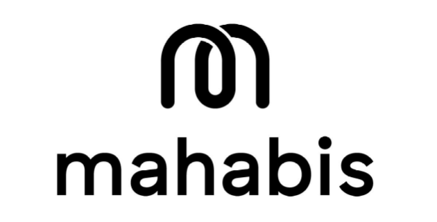
Image Mahabis
Mahabis is a London-based company who make cool and minimalist slippers. Mahabis also strives to show how the most simple things (done well) can make a difference to your life. On first glance their logo hasn’t got much going on. However, that’s precisely why it’s so clever...
Mahabis have created a logo that’s unforced, but that has simple nuances to make it more memorable. The image sitting above its name shows both an “M” and one slipper sat over the other. The color scheme is bare but simple and elegant. Mahabis doesn’t demand you attention, it eases its way in and sits comfortably in your mind, just like its slippers do on your feet.
Conclusion
A good logo conveys ideas about your brand to your customer in a subtle, indirect way. It should stay with your customers long after they’ve left your site, making an impact on them that will keep your business at the forefront of their minds. Find a good logo maker and get creative. Remember the power of the color wheel for your brand and experiment with a few different ideas — it’s the face of your brand, and is worth getting right. Take a moment and let us know which are your favorites in the comments below.


Your Comments :